Partner Summit-CASE STUDY
Partner Summit campaign built around connection, momentum, and shared paths.
Overview
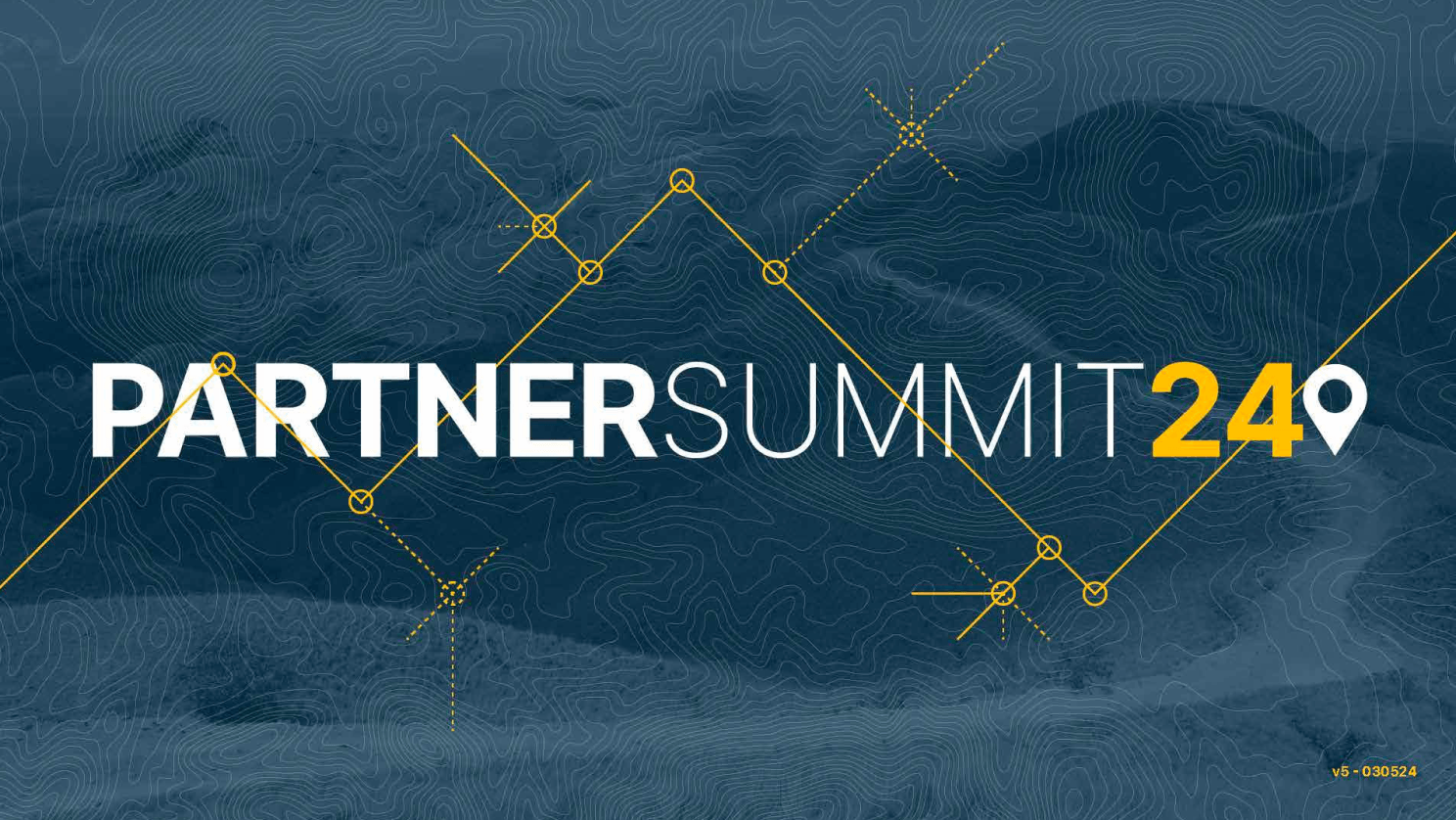
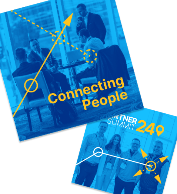
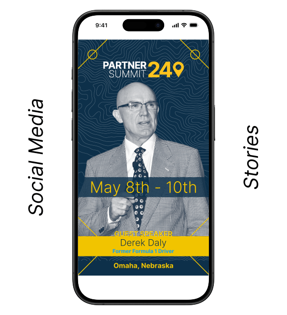
Partner Summit needed a visual direction that felt clearly connected to Carson Partners while still bringing its own energy and sense of forward motion. The concept drew from partner relationships, journey paths, and waypoints of connection—ideas that shaped a system built around momentum, interaction, and shared progress. The palette remained rooted in Carson Partners brand colors, with the addition of yellow from the extended Carson brand system to bring added brightness and emphasis. The result was a look that felt aligned with the parent brand while giving the event a distinct identity of its own.
My Role
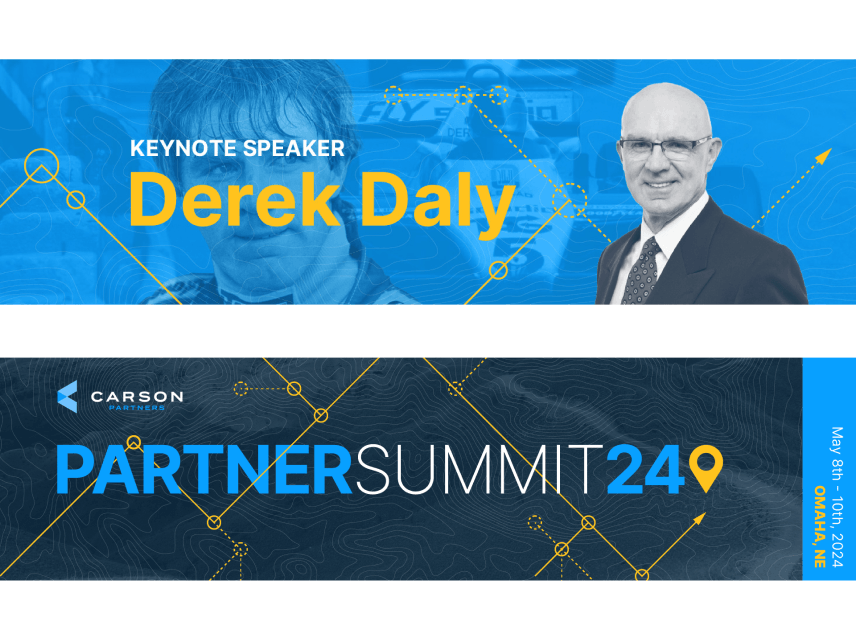
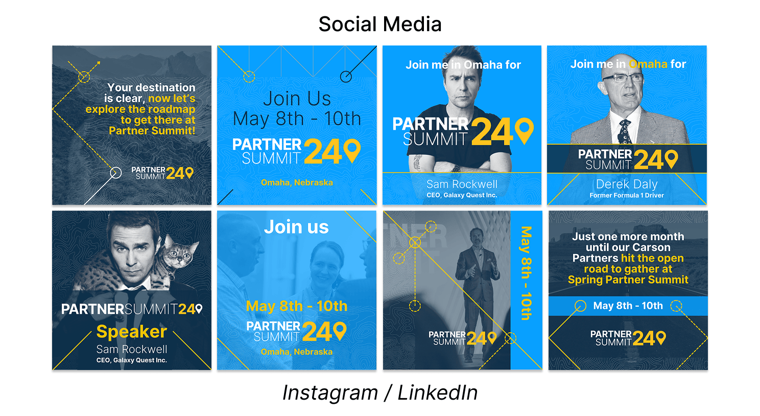
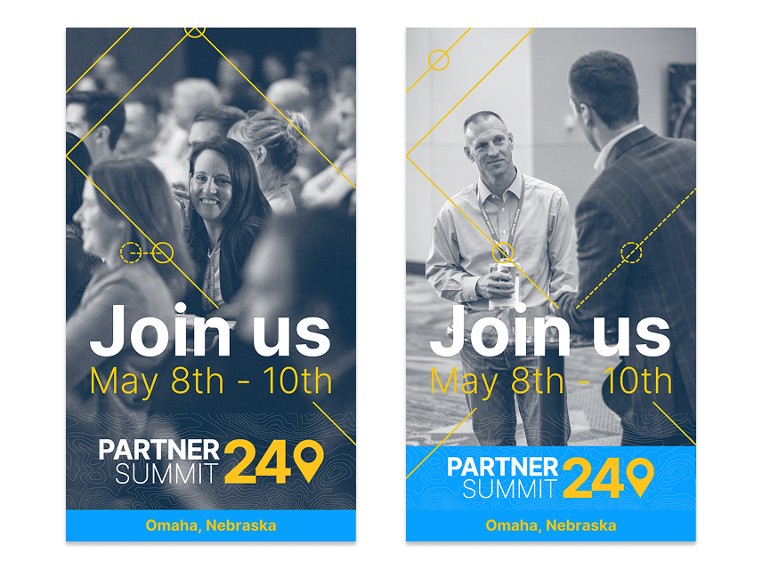
My role was to establish that design direction and extend it across a range of digital touchpoints. I created assets for LinkedIn, Instagram, and CVENT, the platform used by the internal events team. The goal was to build a visual language that could flex across formats and audiences while staying cohesive, recognizable, and easy to apply.
System + Application
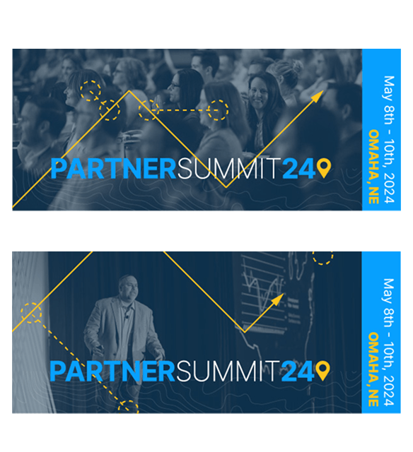
The design system turned a conceptual theme into a practical set of campaign assets that supported promotion before and during the event. Across social media and event-platform applications, the work created a consistent visual thread that reinforced connection, movement, and shared direction. Rather than treating each asset as a one-off, the system was designed to feel unified across channels while remaining adaptable to different content needs.
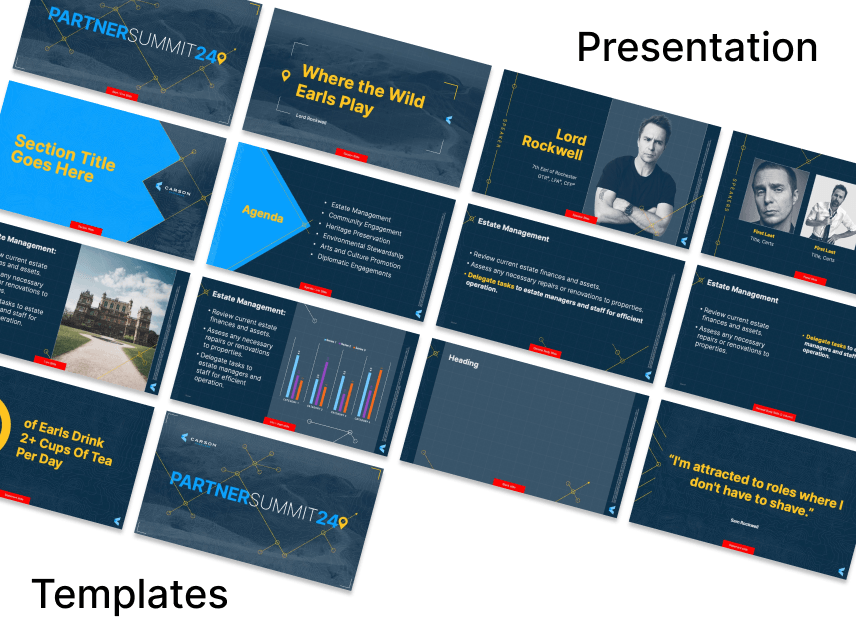
Presentation Design
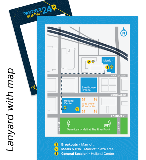
I also designed the main keynote presentation, extending the visual system into a large-format storytelling environment for the event itself. Below are sample sections from that deck. The same design direction carried into the physical event environment as well, where teammates applied it to signage, directional graphics, schedule displays, and other spatial details throughout the venue. Together, the work created a more unified experience across social promotion, platform touchpoints, presentation content, and the on-site environment.

Outcome
The final result was a connected event campaign system that balanced brand alignment with a more energized expression. It gave the event a stronger visual identity across digital and presentation touchpoints while providing the team with a practical, scalable system built around a clear conceptual thread.
Main Keynote Samples:
Sample 1 presentation: Click to view
Sample 2 presentation: Click to view
The main keynote was designed for a panoramic screen format, while breakout-session decks used a standard 16:9 layout.